BEFORE you can successfully house anything--a dog, a chicken, a car, or hi-fi system--you must examine it to find out how it operates and what limitations it imposes on the design of its housing. We have already done that for various types of audio equipment. We have also taken a look at the room in which the system is to go.
There is one more factor which must be considered before the specific design ideas for your system can be put into concrete form.
That is the question of what is good design.
Elements of good design
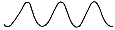
Fig. 301. The sine wave is the simplest regular waveform.
A good design is one that functions properly. That is to say, it serves adequately the purpose for which it was built. But what makes it pleasant or unpleasant to look at, proportionate or disproportionate within itself? This is a question that is difficult to answer, because there is so much of individual taste and judgment involved. However, certain basic principles underlie the whole question and knowing a little about them will help you formulate opinions more clearly.
That you have this guide in your hands indicates that you're interested in high fidelity, which in turn shows that you know something about music. Since some useful analogies can be drawn Fig. 302.
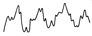
Fig. 303. Noise is
characterized by its random irregularity.
When a wave contains a harmonic it becomes complex.
A[though this waveform is not smooth it repeats at regular intervals.
between music and design, let's start from something you already know and work out from there. In the area of auditory sensations, what distinguishes music from noise? Music has a type of order about it that noise does not. If, for example, you feed into an oscilloscope a single musical tone without harmonics, you will see regular and orderly repetitions of the same waveform (Fig. 301). Adding a harmonic changes the shape of the wave. You'll have a more complex curve, but the wave will remain regular in that you ...
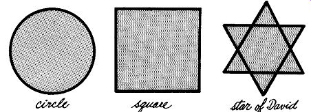
Fig. 304. These simple shapes illustrate visual order.
... will see now repetitions in an orderly fashion of a more complex waveform (Fig. 302). Now feed some noise into the same scope.
You'll see waveforms, but they will be neither regular nor orderly (Fig. 303). Perhaps you're thinking-and rightly, "that's all well and good, but I've heard musical sounds that pretty well approximate noise." In some of the more modern compositions dissonances do sound close to noise. And by the same token there are noises, such as the whistle of a steamship, that are definitely musical.
Fig. 305. A magnified view of the crystalline structure of a snowflake
showing a complex example of visual order.
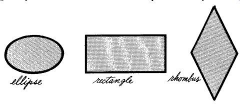
Fig. 306. The ellipse, rectangle and rhombus illustrate order.
In the field of design we can take this same basic proposition practically verbatim. Design is an ordered form of visual experience whereas that which is not design is a non-ordered or disordered form of visual experience. A random outcropping of rocks on a Vermont hillside is not design but the shapes of the leaves of, say, an oak tree on that same hillside are. They have a regular pattern and order in their shape. The simplest designs that we can recognize, whether man-made or natural in origin, arc those based upon geometric shapes. The circle, the square, the six-pointed Star of David, all have a regularity that constitutes visual order (Fig. 304). The same is true of more complex geometric forms such as those in a microscopic view of a snow flake (Fig. 305), or the patterns seen in a kaleidoscope. These more complex and decorative patterns, arc still based upon the simple geometric forms of regular five- or six-sided figures. The ellipse, the rectangle and the rhombus (Fig. 306), exhibit a slightly different formal order from the geometric figures mentioned. The familiar parallelogram is also an ordered shape (Fig. 307). But the basis of its orderliness is not quite as obvious as that of the previous examples.
Static and dynamic order
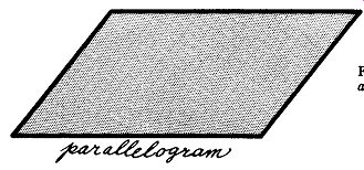
Fig. 307. The parallelogram is a simple figure which contains the elements
of movement.
There are two types of order. One is static and the other is dynamic. Let's go back to music again for a moment, for an analogy. The asymmetrical dominant seventh chord is just as much music as the balanced and static tonic chord from which it is derived and into which it ultimately resolves. The dominant seventh is just as orderly as the tonic chord but it exhibits a different kind of order. The same thing is true in visual design.
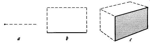
Fig. 308. Dynamic effects can be produced by static elements: (a) a
point generates a line; (b) a line generates a plane; (c) a plane generates
a solid.
Some designs show a static kind of order and others obtain their order from the balancing of a number of dynamic forces within the design. To understand how this happens, let us go back to the simplest component element that one can use to construct de signs. You may recall from elementary geometry that a point generates a line, a line generates a plane, and a plane generates a solid (Fig. 308). Much the same thing is true in design except that the mathematical point has no relevance for our purpose and we begin with the line. If you stop to think about it, there are only two fundamental kinds of lines: straight and curved (Fig. 309). There are only two kinds of straight lines. One is the static line which is either horizontal or vertical. The other, the dynamic line, is at any angle in between (Fig. 310).
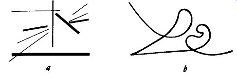
Fig. 309. There are only two basic kinds of lines: (a) straight; (b)
curved. However, these simple elements can be used to create patterns
which imply movement.
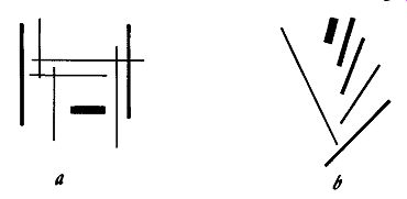
Fig. 310. Lines of force, dynamic lines, are produced by angular conformations:
(a) although a static composition the vertical and horizontal lines produce
areas of force; (b) the simple angled lines produce a greater feeling
of movement.
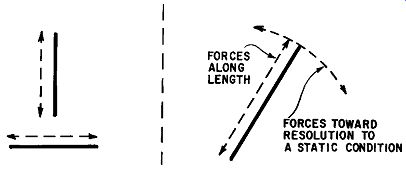
Fig. 311 (left). Visual forces (arrows) produced by static lines. Fig.
312 (right). Dynamic lines produce stronger and more varied forces.
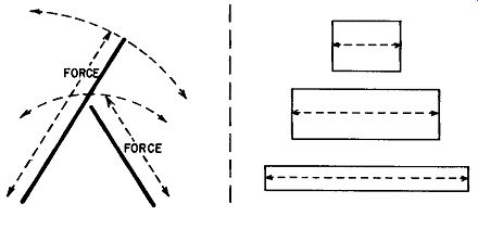
Fig. 313 (left). Converging dynamic lines produce an even greater number
of visual forces. The result is an enhanced sense of motion. The figure
seems to be poised, ready to move. Fig. 314 (right). Horizontal rectangles
have a basic direction along their long axis. They "want" to
spread.
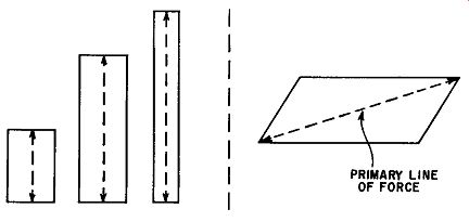
Fig. 315 (left). Vertical rectangles also seem to want to move along
the long axis. Because of their upright form they seem to try and stretch.
Fig. 316 (right). The direction of a parallelogram is along the primary
line of force. It seems to want to resolve back into a straight line.
The horizontal or vertical line has force and direction along its own length but that is all (Fig. 311). Like the tonic chord in music, it is at rest. It doesn't feel as if it wants to go anywhere beyond where it is. By contrast, the angled line is similar to the dominant seventh in music. It has its own internal force along its length, as do horizontals and verticals, but like the dominant seventh it seeks resolution. The eye wants to resolve it to the nearest horizontal or vertical (Fig. 312). The angled line in design calls for another to counter the force with which it seeks resolution (Fig. 313). In this way it begins to find balance in the forces inherent in the directions of the two lines. In the design of furniture, angled lines can be brought into balance against horizontals or verticals or, occasionally, be left in an unbalanced condition. It is on the basis of the inter-relationships between the forces and directions of lines that a full-grown design is finally developed. By using groups of connected lines, we can begin to develop planes and these planes, like lines, will give the eye a feeling of force and direction. For example, a low, wide rectangle will partake of the feeling of a horizontal line. The lower and wider it is, the more it will assume horizontality (Fig. 314). A high, narrow rectangle will feel strongly similar to the vertical line and, again, its verticality will be strengthened by an increase in its narrowness relative to its height (Fig. 315).
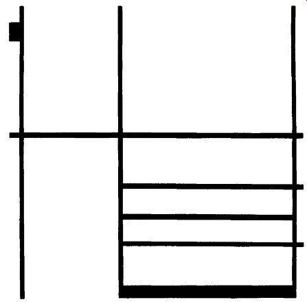
Fig. 317. Piet Mondrian pioneered in producing a sense
of movement through the use of static lines. Shown is "Composition
in White, Black and Red." (Collection, Museum of Modern Art.)
The planes formed by horizontal or vertical rectangles or squares, since they give the same general feeling as a static line, would be considered static planes. Compare this with the feeling you would get from a plane in the shape of a regular parallelogram.
The main feeling of direction in such a plane would be along a diagonal through the two acute angles of the parallelogram (Fig. 316). This in turn is a dynamic line, and the entire plane partakes of the feeling of restlessness inherent in the dynamic line forming its main direction.
Probably you have already anticipated the reason why so much furniture, both historically and in modern times, has been de signed around solid masses which, in turn, were constructed from combinations of static planes. If a home or the furniture in it were designed on a basis of dynamic planes, perhaps parallelograms or, worse yet, completely irregular figures of one sort or another, it would be an unnerving place in which to live. If there were no repose or resolution in the design of one's surroundings, the visual influence could have quite profoundly disturbing emotional effects.
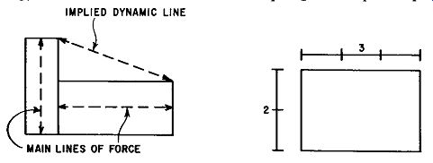
Fig. 318 (left). Horizontal and vertical rectangles imply a diagonal
dynamic line. The static forms create dynamic forces. Fig. 319 (right).
Horizontal rectangle proportioned two to three.
Dynamic lines in furniture
Does this mean, then, that the only satisfactory lines for furniture are static ones? Not by any means. To return to our musical analogy, this would be the same as attempting to compose a piece
of music using nothing but the tonic chord. The dreadful dullness of such a composition is not difficult to imagine. But, fortunately, here our analogy between music and design breaks down a little. In music we have only one tonic chord in a given key; in design we have two tonics, the horizontal and the vertical, and they can interrelate with each other in interesting ways.
The interrelationships between horizontal and vertical lines were extensively explored in recent years by the painter Piet Mondrian, and many fields of design, furniture included, have benefited greatly from his explorations. Among other things, he demonstrated that it is possible to organize a series of rectangular areas which are inherently static in such a manner as to create a dynamic whole (Fig. 317). This dynamism results from diagonals or, if you please, dynamic lines that are implied rather than expressed directly.
Actually, only the terms, not the reasoning, are unfamiliar.
Suppose you have a horizontal rectangle and at the end of it you join on a vertical rectangle (Fig. 318). It doesn't matter whether this drawing is an end in itself or a sketch for a piece of furniture or a building. You've implied a diagonal running down from the vertical to the horizontal rectangle.
This is exactly the sort of thing that is done by a designer when he works out an interesting pattern of doors and drawer fronts, on a cabinet with a front plane that is a simple horizontal or vertical rectangle. Let's demonstrate this by taking a simple horizontal rectangle with a relationship of height to width of 2 to 3. This happens to coincide exactly with a standard cabinet's case dimensions of 2 feet by 3 feet wide.
We'll assume that this 2 by 3 rectangle forms the outline of the front plane of a cabinet that will be used to house hi-fi equipment (Fig. 319). Let's look at some of the ways in which the plane can be subdivided to make it visually more interesting and, at the same time, subdivide it in such a way that adequate spaces for equipment inside the cabinet will be provided. All the arrangements inherent in even such a simple appearing problem as this are too numerous to cover here. So we'll stick to some of the simpler possibilities and see why they were used.
After you've seen the how and why of these, you'll possibly think of some solutions of your own that you like better.
The simplest thing possible is to make a vertical division of the space right down the middle. In practice, a pair of doors could be hung at the sides and meet in the middle. Behind these doors you would make internal subdivisions in the cabinet for your various pieces of equipment and perhaps record storage.
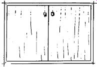
Fig. 320. A cabinet front designed to the proportions of Fig. 319.
Right off, thinking in terms of a cabinet, there are many ways in which even a simple subdivision of a space can be accomplished, each of which will result in a slightly different appearance. One way is to hang the doors flush with, but inside the front edges of both the sides, the top, and the bottom. This in effect doubles the outline and strengthens the shape of the original horizontal rectangle relative to the two new vertically created rectangles (Fig. 320).
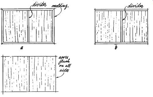
Fig. 321. A few simple alterations add interest to the plain cabinet
front: (a) simple center partition; (b) doors overlap on the sides only;
( c) doors overlap all edges and the center partition.
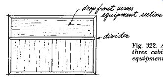
Fig. 322. Another variation of the two by three cabinet. The drop front
across the equipment section produces the low long look.
There are also three other immediate ways of achieving substantially the same functional effect with a slightly different visual effect in each case. First, let's bring a center partition through between the doors (Fig. 321-a). This doubles the center vertical line and increases the feeling of verticality as against the horizontality of the outline. Now let's try letting the doors overlap the sides but not the top and bottom (Fig. 321-b). And, finally let's try letting the doors overlap both sides and the top and bottom so that all that is seen from the front are two vertical rectangles comprising the doors (Fig. 321-c). Each of these variations has a slightly different visual effect. And, remember, we've been talking only about what is really one basic kind of subdivision of a rectangle as applied specifically to our audio cabinets.
Still talking only about possible subdivisions of a 2 by 3 rectangle for the front of an audio cabinet, let's look at a few more possibilities. We could have a drop front dear across the upper portion of the cabinet over the equipment, and doors opening over the lower section for record storage (Fig. 322).
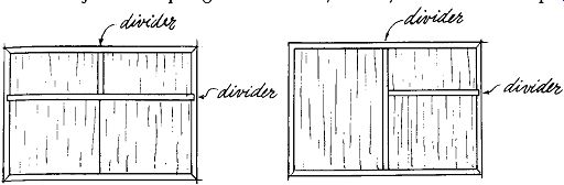
Fig. 323 (left). The upper portion of the basic cabinet
can be divided for equipment controls and the changer compartment.
Fig. 324 (right). The section on the left is for storage. The two sections on the right are for equipment.
Fig. 325. Although the tapered legs add to its appearance the cube form
contains no dominant forces to create visual interest.
Or, leaving the lower section as it now is, we could divide the upper portion into two parts, one opening over the equipment controls and the other opening for the record player (Fig. 323). We could split the cabinet in half vertically and use one half for the equipment and record player, each opening separately, and leave the other half in a single unit for storage (Fig. 324). This is just a sampling of the variety of ways in which a simple 2 by 3 rectangle representing the front of an audio cabinet can be subdivided to allow for the mounting of the equipment and at the same time vary the space relationships within the plane of that front.
Up to this point, we have studied two methods of enlivening a simple, rectangular plane-either adding onto it from without or subdividing it from within. In the process of working out a design for a piece of furniture, these devices can be used singly or in combination. And we have not by any means exhausted the possibilities inherent in internal subdivision. We haven't mentioned grain, color, texture or various types of decorative detail, all of which can be used to increase visual interest. However, let's leave these matters in abeyance for the moment. We'll come back to them later.
So far we've been dealing with lines and planes without assembling them into the solid three-dimensional objects of furniture. Select a piece of furniture in your living room and try to get it into such a position that you can see only the front or one side. It's a bit difficult, isn't it? This points up the fact that you see any piece of furniture, not as a single plane at a time, but as at least two or more planes forming the surfaces of a solid. This solid is pleasing or not in its proportions, depending upon how these planes relate to each other.
Three dimensional relationships
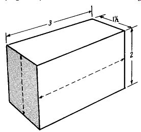
Fig. 326. Rectangular solid; two by three by one and one-half.
Suppose you were to design a piece of furniture in the shape of a cube; that is, all the surfaces are squares. A square is a shape that has no dominant direction and, if all of the sides of an object are square, the whole piece has no dominant direction (Fig. 325). It would be dull and very difficult to liven up even by judicious use of interesting grains or decorative detail.
Now let's go back to our 2 by 3 proportioned front and develop it into a solid by giving it a depth of half the width. The resulting object will have a front wider than it is high with sides higher than they are wide. The front then will have a predominantly horizontal direction while the sides will have a vertical one (Fig. 326). As we look at our object, the interplay of these two dominant directions vastly increase the visual interest of the object as a whole compared to, say, that of a cube. In the same ways that we found we could add to the interest of a plane, we can increase the interest of a solid object by adding onto it externally or subdividing it internally.
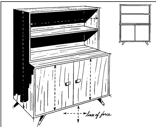
Fig. 327. Variations in depth add interest to a basically simple design.
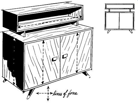
Fig. 328. By setting back the top shelf and raising it on spacers the
design of Fig. 327 takes on a fresh modern look.
Returning to our simple 2 X 3 X 1 ½ case, let us try a few three-dimensional variations. The simplest subdivision of the unit was to split the front down the center into two swinging doors. We'll start with that arrangement and try some external additions. One of the simplest and most useful would be to place a couple of open shelves on top for either books or records. By looking at the front planes or front elevation of this variation, we don't appear to have made a very interesting change. Fig. 329. Adding a speaker enclosure of the same size and shape to a simple cabinet produces a functional unit.
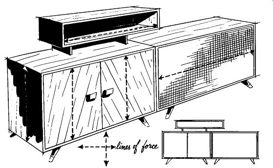
Fig. 330. Placing a shelf on the original cabinet of Fig. 329 produces
a much marl' interesting total grouping.
But let's look at it in perspective. By making the shelf section approximately one-third shallower than the main cabinet and leaving the front of the shelf open, we have introduced variations in depth that add new interest (Fig. 327). Now let's cut the shelf section down from two compartments in height to only one and we'll raise that one compartment about 3 inches above the main cabinet on a pair of runners. In both front elevation and perspective, this arrangement gains a good deal in terms of interest over our first try (Fig. 328). Next, let's add, alongside our original cabinet, a cabinet matching it in size to be used as a speaker enclosure. This is a very common and not very inspired type of addition. On the other hand, it's certainly not unpleasant and has the undeniable virtue of being highly functional (Fig. 329). At this point, we've added to our original cabinet both vertically and horizontally. Now let's try combining the two movements. We'll add both the bookshelf and the speaker and we'll move the bookshelf off center on the original cabinet so that it's cantilevered out over the speaker cabinet (Fig. 330). Again we've added to the number of visual movements and directions and to the visual interest of the whole. Remember that the illustrations we've examined are not intended as original or brilliant design contributions. Quite to the contrary, they are the simplest possible examples of certain principles. They are intended to resemble things you've seen before, so that you'll be able to visualize readily. Studying them is an exercise in looking at familiar objects from a slightly more analytical viewpoint.
Variations can be made to a three-dimensional shape by either external additions, which we've just discussed, or by internal subdivision or combinations of both. To keep it simple, we'll stay with our 2 X 3 X ½ case, and this time try adding a third dimension to a couple of variations we have found we could make on its front. Let's try the one that had a drop front across the top over the equipment and a horizontal record-storage section below. This time we'll take the doors off the record storage section so that the lower section will now recede in depth.
Fig. 331 shows it in perspective both with and without the doors.
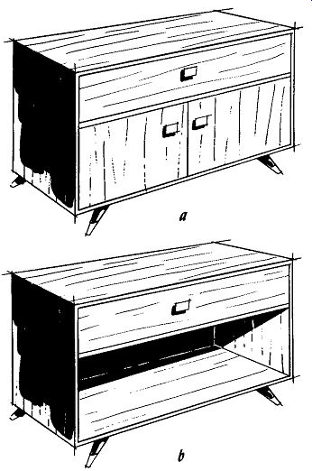
Fig. 331. The use of depth as a dimension: (a) simple drop front cabinet
with storage space; ( b) removing the lower doors makes the bottom section
recede, changing the character of the piece.
Another variation of this same arrangement would be to put the lower doors back on but inset them by about 2 inches. Still another would be to leave the lower doors flush and inset the drop front at the top by about ½ inch (Fig. 332). There is, as we have found out, quite a wide range of measures that can be taken to enliven what is basically an extremely simple design but before we move on to other things, let's look at one example of a combination of external addition and internal subdivision. We'll take one of the examples of subdivision that we have already used and add to it the matching speaker enclosure plus the floating storage shelf on top (Fig. 333). There are many more possibilities inherent in mere static lines, static planes and static solids than might have seemed possible at first.
Dynamic planes
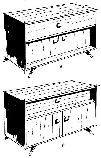
Fig. 332. Depth can be used with greater subtlety than shown in Fig.
331: (a) the lower doors of the unit are inset; (b) insetting the drop
front seems to reduce the mass of the unit.
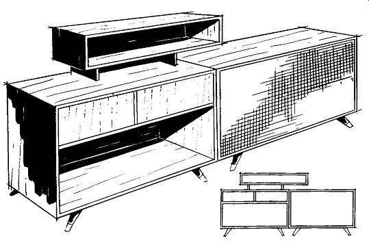
Fig. 333 (above). By combining a number of features a stimulating effect
can be produced.
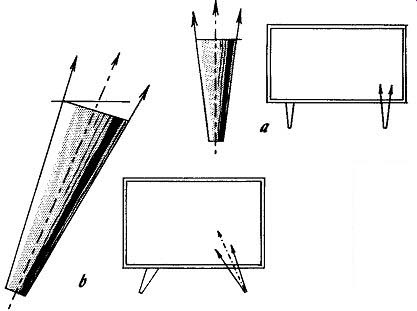
Fig. 334 (left). The creation of dynamic lines by static shapes can
be achieved through simple detail: (a) the tapering of the leg makes
it in to a dynamic element; (b) b)' tilting the leg the central axis
and the outline be come dynamic.
Happily, however, these elements are not, by any means, all we have available. We can imply dynamic lines by the way in which static shapes are used. There are also occasions when dynamic lines and dynamic planes can be used directly. One of the first applications is leg treatment. Think about it a moment and you'll discover that practically all of the furniture leg shapes you see around involve the use of dynamic lines in one form or another.
By trying several different legs under our standard cabinet we can see how this works out. First, the straight, round, tapered leg. Although the central axis of the leg is vertical, the actual outlines, since the leg is tapered, are angled and therefore dynamic (Fig. 334-a). Next take the same leg and angle it. This time both the central axis and the outlines are dynamic (Fig. 334-b). For another try, let's make a base using a square tapered leg at the corners. If we keep both the axis of the leg and its outside outline vertical, we'll still end up with a dynamic line on the inside to form the taper (Fig. 335-a). We can, of course, take the same base and cant the whole leg so that we have both a dynamic axis and a dynamic outline (Fig. 335-b). To introduce a dynamic plane, the baffleboard, for example, of a speaker enclosure can be tilted in at the top, thus making the entire front surface a dynamic plane (Fig. 336). As a matter of fact, in some cases, the acoustical people recommend doing ...
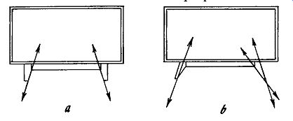
Fig. 335. Keeping the axis of the leg and its outside outline vertical
does not necessarily make it static: (a) the inner taper produces dynamic
lines; (b) canting the whole leg relative to the base produces much more
vitality.
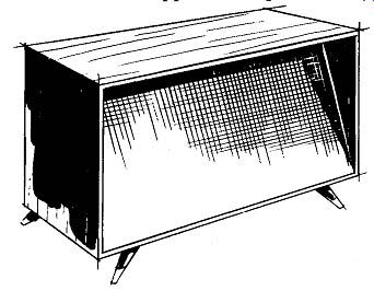
Fig. 336. The use of a dynamic plane adds interest to a simple rectangular
form.
…this with speaker enclosures to improve the balance of sound distribution throughout the room.
If you want to cant a baffle-board or a control panel for reasons either of function or appearance, go ahead; you can come up with perfectly good results this way. But don't try canting in the sides of the whole cabinet. The results are likely to be weird and difficult to live with (Fig. 337).
Use of curves
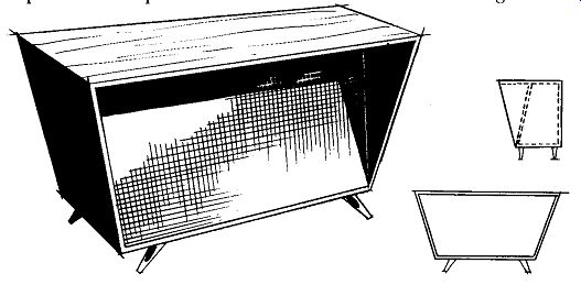
Fig. 337. Dynamic planes are dangerous to handle and sometimes the results
are disappointing.
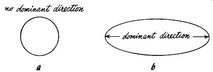
Fig. 338. The circle and the ellipse are the ancestors of curved lines;
(a) the circle is as static a plane as you can get-it has no dominant
direction; (b) the ellipse does a little better in that some line of
force is implied.
Another very important area of design is the subject of curved lines and curvilinear shapes. We have discussed straight-line and flat plane shapes first because these are properties inherent in our main raw material, wood, as it comes ready for fabrication into cabinets. Plans that do not take into account the inherent properties of the materials to be used are more than likely to come to grief. Wood can be carved, edge-cut, edge-shaped, or turned to curved lines with reasonable facility but to bend a curve into the length or width of a plank or panel is well nigh impossible. Keep these factors in mind while looking at the design effects of curved lines and curved shapes to relate such elements usefully to our specific subject.
One of the most common complaints heard from those who prefer traditional furniture styles is that the moderns, having removed the curvilinear carvings, moldings and turnings of the earlier styles, have ended up with a style that is too rectangular, too straight, too boxy and, therefore, lacking in the warmth and grace of the more traditional designs. There is unquestionably some merit to this argument; how much depends on individual taste. The inclusion of curvilinear lines and shapes in the design of cabinets can add a gracefulness and flow that will endow them with a character and distinction absent from designs comprised entirely of straight lines and angular masses. Let's examine some curved lines and curvilinear shapes as such and then we'll see how they apply to cabinet design.
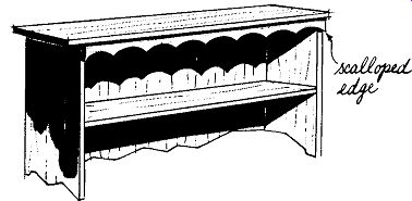
Fig. 339. The scalloped edge is a regular waveform and consequently
is fairly static.
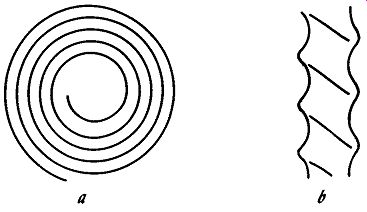
Fig. 340. The spiral form is more dynamic than the regular waveform:
(a) spiral in a plane; (b) the solid spiral. Fluting of this kind was
often used on furniture legs.
There is no such thing as a static curved line in the same sense that we have a static straight line. The nature of a curve makes this impossible. It is never at rest but is constantly changing in direction and therefore cannot become static. There is a feeling of constant movement about a curved line, and this restlessness constitutes its vitality. Certain curves are more nearly static than others. The circle is the most static possible (Fig. 338). Although it is continually changing in direction, its rate of change is absolutely constant. The circle, like the square, having no predominant dimension, has no predominant line of force. This makes it not quite as interesting as it might be. On the other hand, it is for the same reason immensely flexible, often taking on whatever axis may be desired from its relationship to other elements.
Similar to the circle in many respects is the ellipse or oval. It has much of the same character as the circle except that it does have a main axis and, in consequence, a main direction. Another of the more static types of curves would be any of the variations of the regular waveform pattern (Fig. 301 ). Although constantly in movement and constantly changing direction, it is also endlessly repeating itself. A variant of this would be the type of ...
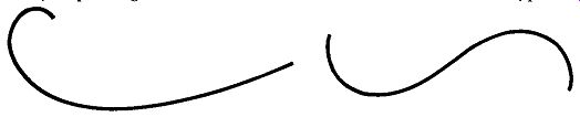
Fig. 341 (left). The curve of force illustrated is remarkably
similar to the cross section of an airplane wing. Fig. 342 (right).
The reverse curve starts to go in one direction and then changes its
mind. It is widely used in period furniture.
... repeated arc of a circle that forms the scalloped edges on many early American cabinet and table aprons (Fig. 339). Somewhat more fluid but still partaking strongly of a feeling of regularity is the spiral (Fig. 340-a). It has been used in the form of either a linear surface decoration or fluting as on the legs of some Spanish-Moorish furniture (Fig. 340-b).
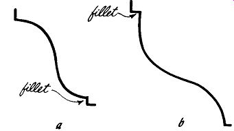
Fig. 343. Reverse curves are often used in moldings: (a) the cyma recta;
(b) the cyma reversa.
The curves we've studied thus far, along with their variations and combinations, fall into two classifications. The first is the geometric curve. The circle, the ellipse and any variations based upon them fall into this category. Certain other geometric curves such as the parabola, the hyperbola, the catenary and exponential curves have not been discussed because they do not occur in furniture. While the catenary and exponential curves appear in engineering computations on which the inside partitioning of certain speaker enclosures is based, we are not going that deeply into acoustical design and these curves do not concern us. The waveform, the spiral and their variants form our second category, that of repetitive curves.
Categories of curves
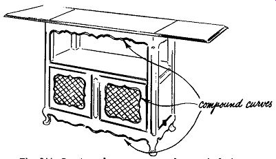
Fig. 344. Compound curves are used extensively in French Provincial
furniture.
Three additional types of curves can be applied to furniture.
The first of these is the one-direction curve or, as it is sometimes called, the curve of force (Fig. 341). The one-direction curve starts with a slow, gentle sweep and ends with a quick curl. It is the simplest of the free hand curves. Sometimes it bears a close re semblance to a spiral and at other times is quite distinct. In period styles, it is sometimes encountered in decorative carvings and in the outlines of cornices on tall cabinets or in the out1ine of a scroll-cut apron at the bottom of a cabinet.
The reverse curve is far more common, recurring constantly in many period styles. It starts off curving in one direction and part way along reverses itself and swings off the other way (Fig. 342). It sometimes terminates in a tight curl at one end, sometimes at both ends or sometimes at neither. It is found on the legs of Chippendale, Hepplewhite, French Court, and French Provincial styles and in many styles as an outline curve for aprons, cornices and door panels. It is also used as the basis for moldings such as the cyma recta and the cyma reversa (Fig. 343). Compound curves are actually combinations of curves. The complete outline, for example, of a French provincial apron might be a compound curve composed of a number of reverse curves tied end to end (Fig. 344). Compound curves also turn up continually in the cross-sections of many types of moldings (Fig. 345). The free-form curves of modern design are not particularly new. They are combinations of one-direction and reverse curves but are far less regular and often tend to be totally asymmetrical.
The popular kidney-shaped or amoeboid-shaped cocktail tables are unhappy examples of the free-form curve carried to its most uninspired conclusion.
Proportion and balance
Before proceeding further, let's summarize briefly. With reference to furniture, design starts with line. Lines combine to form planes and planes combine to form masses. All of these elements have readily discernible visual forces and directions. The manner in which these directions and forces relate to each other to form visually satisfactory unity in a piece of furniture falls under the headings of proportion and balance. These are difficult subjects to discuss in a general way because any individual's sense of pro portion and balance is likely to be largely influenced by his own conditioning and what he has been accustomed to seeing.
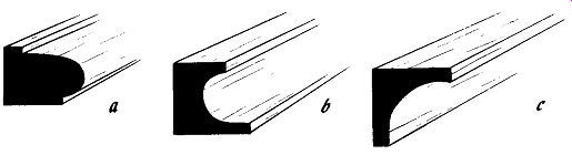
Fig. 345. Compound curves form the basis for many types of molding:
(a) thumb nail; (b) scotia; ( c) cove.
Fig. 346. The Directoire is an example of the almost spartan Neo classic
simplicity.
There are many in the fields of art and design who would start a lively argument on this point, claiming that there are definite canons of proportion and balance they can prove. Looking back historically, one can find that a number of such canons have been proclaimed at different times. From the numerology of the pyramids to the dynamic symmetry of the Greek vase and on up to the present day, individuals and schools of thought have tried to establish the Divine Proportion. The fact that the various rather dogmatically proclaimed canons do not too often agree with each other tends merely to strengthen a conviction that visually satisfying balance and proportion are largely influenced by individual and cultural considerations and are not the result of some eternal and divine law or mathematics that can be discovered and promulgated once and for all. No one would claim for a moment that the architects of the Parthenon and the Cathedral of Notre Dame followed the same divine proportioning. Y ct each is an object of beauty in its own right despite the easily established fact that each is based upon a totally different concept.
The same kinds of comparisons can be made in furniture. The neo-classic simplicity of the Directoire style (Fig. 346) has a beauty of its own but one that is quite at variance with that found in the Baroque-influenced furnishings of the French Provincial style.
(See Fig. 344.)
----------
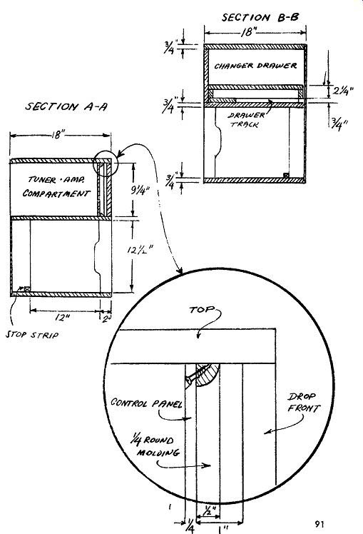
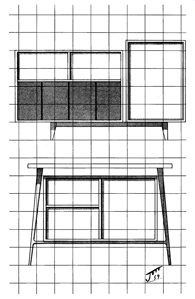
Fig. 347. A scaled drawing of cabinet.
Although in good conscience we cannot set down rules to deter mine balance or proportion, a few pointers can be used as guides.
Proportion and balance are so closely related to one another that it is difficult to tell where one leaves off and the other begins. The simplest way to obtain balance in a design is by means of symmetry. This is a 25-cent word meaning that, if you draw a line down through the middle of the piece, the right-hand side would be a mirror image of the left-hand side. This type of balance is used in practically all traditional styles.
In a sense, this would be the same as if you put two equal weights on a seesaw, equally distant from the center pivot point.
They'll balance each other exactly. But you'll undoubtedly also recall that, if you decrease one of the weights and move it further out or increase one and move it further in, the two weights will still balance. This is the basis of the asymmetrical design often seen in modern furniture.
Actually there are only two ways to get balance in a design, either symmetrically or asymmetrically. If you have symmetry, by definition you have balance. It's that simple. You may or may not have good proportions, but you will inevitably have balance.
Asymmetrical balance is another thing, and not as simple. There's a great deal more latitude here for personal interpretation. Here, too, is where proportion and balance become inextricably snarled.
As long as you're using symmetrical balance, you can have a poor relationship of height to width without destroying the balance.
You could also have other unattractive proportions without destroying balance. For example, the cabinet might be top heavy because the legs are too light or too high. Or, it might seem bottom heavy because the legs are too big. For this reason, symmetrical design is easier to work with because you can isolate the two problems of balance and proportion.
But leave symmetry behind and you're in the wide open spaces.
Both questions must be dealt with at once. Here's where you've got to rely on your feelings for the forces and directions of the planes and masses involved, to achieve satisfying proportion and balance in asymmetrical designs.
The scaled drawing
When you get ready to start finalizing your ideas about hi-fi cabinets, the only way you can reasonably check the proportion and balance of what you have in mind is to make a scaled drawing.
The basic procedure for scaling a cabinet is no different from that used to scale a floor plan except that the scale units will have a different meaning. Whereas ¼ inch equals I foot is a common scale for floor plans, in scaling a cabinet ¼ inch generally equals I inch, except for very large units where such a scale might result in an inconveniently large drawing (Fig. 347). Graph paper can be used for scaling. It is quite convenient-no ruler is necessary-just count off squares. But the squares may tend to confuse your overall view of what has been drawn. Unless you are used to visualizing three dimensions from two, the linear pat tern of the paper may be distracting. To avoid this disadvantage, use tracing paper with graph paper underneath to get your scaling, and then take the graph paper away to see what you've got.
But however you do it, and no matter what scale you use or how you arrive at it, make a scaled sketch of your ideas before proceeding with the construction of any cabinetry. Adjustments of as little as an inch or two can make vast differences in balance and proportion. A change of an inch in the height of a drop front or even as little as ½ inch in the thickness of a leg can bring an entire cabinet into or out of proportion.
Color
Before leaving the generalities of design to discuss specific styles, let us touch upon one other subject briefly. That is color. The range of the colors for a cabinet is actually quite limited. But within that range the color chosen can have quite a considerable influence on the success or failure of the effect of the total unit.
The colors you are likely to use will range from off-white blonds to yellow, tan blonds to ambers and from there to various greens, red-browns and grays down to dead black. The most important factor influencing the choice of color for cabinets should be the other colors in the room. If you have light-colored woods, fabrics and walls, the chances are you won't want a big black hunk of hi-fi cabinet. Conversely, if the wood pieces already in the room are largely medium to dark, you won't want a massive blond unit.
If you are using a period style, the color of the unit should con form, in general at least, with the colors historically used for that style. For example, a bleached, mahogany Heppelwhite sideboard or an ebony black French Provincial one would be an anachronism. The colors just don't agree with the styles. A very dark brown Chippendale piece or a very light gray French Provincial one would be appropriate. These colors were used.
There are tricks in the use of color. Against a light wall, a cabinet will look smaller if it is also light in color and larger if it is dark. Against a dark wall, the reverse is true. (The piece will look smaller if dark and larger if light.) In general, a piece will look a little larger if light in color than it would seem if it were dark.
Dark colors tend to show dust more readily-light colors reveal imperfections. Dark colors can obscure the effect of decorative detail, carvings and moldings. Medium-value colors will enhance them.