This section embraces the two major aspects of television design: (1) television graphics and (2) scenic design. Graphics include all two-dimensional visuals that are prepared for the television screen, such as title cards, maps, and charts. Scenery includes all three-dimensional items that are used in the studio, such as flats, furniture, and hand properties. The most prevalent dimensions and preparation methods of television graphics, and the most common types of scenery and properties, are briefly mentioned. The important idea behind design is that if should reflect continuity of style in every item seen on the screen. Thus, the viewer will learn to identify readily the "look" of your operation, and eventually form an image of your station as a whole.
Design is an overall concept that includes not only the lettering and layout on a studio card, or the plan for a set, but the logo of the station, its stationary, the office furniture, and the pictures in the hallways. Design, or the lack of it, permeates everything the station shows on the air and off. It sets the style for a broadcast operation. The logo for CBS, for example, induces us to expect the same high quality from the network's programming.
But a handsome logo will not automatically carry its design qualities over to the programming or to the on-the-air graphics or scenery. What is important here is developing a design consciousness for everything you do; a well-executed logo is merely the symbol for such awareness, not its sole cause.
In this section we will stress two of the most obvious aspects of design: graphics and scenery.

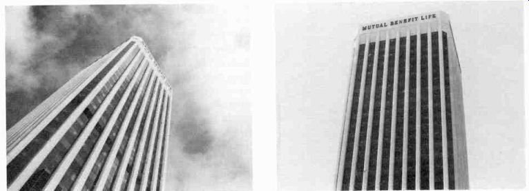
12.1 The logo of a station or network reflects its design consciousness;
it often sets its overall design style. (Courtesy CBS.)
==============
Aspect Ratio The proportions of the television screen, and therefore of all television pictures: three units high and four units wide.
Brightness Attribute of color that indicates the grayscale value, whether the color photographs in black-and-white as a light gray or a dark gray. Sometimes called value.
Character Generator A special effects generator that electronically produces a series of letters and numbers directly on the television screen, or keyed into a background picture.
Chroma Key Drop A well-saturated blue canvas drop that can be pulled down from the lighting grid to the studio floor, or even over part of it, as a background for chroma key matting.
Compatible Color--Color signals that can be received as black-and-white pictures on monochrome television sets. Generally used to mean that the color scheme has enough brightness contrast for monochrome reproduction with a good grayscale contrast.
Crawl Graphics (usually credit copy) that move slowly up the screen; often mounted on a drum, or crawl. More exactly, an up-and-down movement of credits is called a roll, and a horizontal movement is called a crawl.
Cursor A dot produced on the screen by a special effects generator (usually a character generator), indicating the location of the first word or line.
Essential Area The section of the television picture, centered within the scanning area, that is seen by the home viewer, regardless of masking of the set or slight misalignment of the receiver. Sometimes called critical area.
Flat A piece of standing scenery used as background or to simulate the walls of a room.
Floor Plan A plan of the studio floor, showing the walls, the main doors, and the location of the control room, with the lighting grid or batten pattern superimposed over the floor area. More commonly, a diagram of scenery and properties in relation to the studio floor area.
Graphic Mass Any picture element that is perceived as occupying an area within the frame and as relatively heavy or light.
Graphics All two-dimensional visuals prepared for the television screen, such as title cards, charts, and graphs.
Hue The color itself, such as red, green, or blue.
Logo A visual symbol that identifies a specific organization, such as a television station or network.
Moiré Effect Color vibrations that occur when narrow, contrasting stripes of a design interfere with the scanning lines of the television system.
Open Set A set constructed of noncontinuous scenery, with large open spaces between the main groupings.
Props Properties: furniture and other objects used for set decorations and by actors or performers.
Roll Graphics (usually credit copy) that move slowly up the screen; often called crawl.
Saturation Attribute of color that indicates strength, as measured by a deep red or a washed-out pink. Sometimes called chroma.
Scanning Area Picture area that is scanned by the camera pickup tube; more generally, the picture area actually reproduced by the camera and relayed to the studio monitors, which is further reduced by the masking of the home screen and general transmission loss.
Set Module Pieces of scenery of standard dimensions that allow a great variety of interchange and configuration.
Super Card A studio card with white lettering on a black background, used for superimposition of a title, or for keying of a title over a background scene.
Threefold Three flats hinged together.
Twofold Two flats hinged together. Also called a book.
==============
Graphics:
Television graphics include all two-dimensional visuals especially prepared for the television screen, such as title cards, special illustrations, maps, or charts. There are three major factors to be considered: (1) overall specifications, (2) types of graphics, and (3) preparation and actual operation.
Specifications:
Whenever you are preparing graphics for the television screen, you should pay close attention to (1) aspect ratio, (2) scanning and essential areas, (3) readability and balance, (4) color and color compatibility, (5) grayscale, and (6) style.
Aspect Ratio
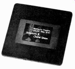
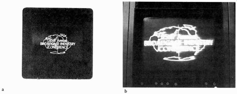
The proportions of the television screen are 3:4; that is, anything that appears there is horizontally oriented within an area three units high and four units wide. All graphic information must, therefore, be contained within this aspect ratio. (See 12.2.) Most artwork-studio cards or slides-is prepared in aspect ratio. You will find that a major problem with artwork prepared outside the television station is the total disregard for this essential proportion. Although our eyes can very readily adjust to some other aspect ratio, the television camera cannot. If you pull back far enough with your camera to include the entire out-of-aspect-ratio studio card, the information on it is likely to become so small that it is unreadable. Or, you can crop the card so that it fits the aspect ratio. But then you will lose important information.
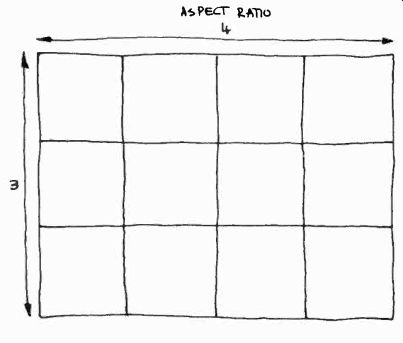
12.2 The television aspect ratio is three units high and four units wide.
12.3 When showing an out-of-aspect-ratio studio card in its entirety, the
information usually becomes so small that it is no longer readable.
12.4 By moving the camera in closer so that the graphic fits the aspect ratio
of the television screen, important information is lost in the cropping process.
12.5 Vertically oriented slides should not be used on television, since they
lose their top and bottom information. Also, there will be black spaces on
the sides of the screen, since the vertical slide will not fill the entire
screen width.
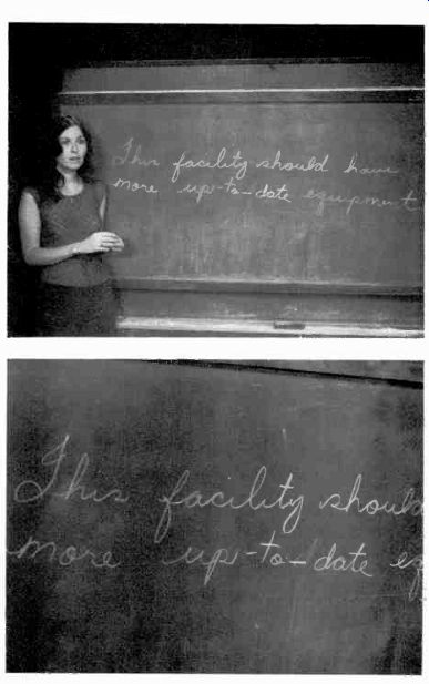
12.6 Normal writing on the blackboard can present a serious aspect-ratio
problem. The camera cannot show a closeup of a sentence that stretches over
the width of the blackboard.
Slides can be used only if they are horizontally oriented. Vertical slides not only lose a major portion of the information but also look bad on the screen. (See 12.5.) You will find that blackboards can present a special aspect-ratio problem. If, for example, the television teacher writes on the blackboard in her usual way, starting on the left side and moving across to the right side, you will not be able to fit the whole sentence into the shot unless you take a long shot of the entire board and reduce the legibility of the information (see 12.6). One workable solution is to have the blackboard divided into several aspect-ratio fields. If the teacher stays within the borders, you can show the entire information in a closeup shot (see 12.7). There are instances in graphics, however, where out-of-aspect ratio is not only usable but desirable. Take a chart with a steeply rising curve (12.8). A slow, tight tilt up the curve reveals the information more vividly than a long shot of the whole chart, or a shot of a chart drawn within the aspect ratio. The same is true, of course, for a horizontally oriented, out-of-aspect-ratio chart whose information gains in impact by a gradual revelation through a pan.
If you need to use graphic material that must be shown in its entirety, yet which is out of aspect ratio, mount it neatly on a large card that is in aspect ratio. You simply frame up on the large card, keeping the out-of-aspect-ratio information as nearly screen-center as possible.
Scanning and Essential Areas
But even when the graphic material is in aspect ratio, part of it still may not reach the home screen. Within the aspect ratio, there is a peripheral loss of picture area caused by the various electronic manipulations between camera and home reception and the masking of the television screen. The picture you see in the camera viewfinder usually shows more picture area than the control-room monitor, and a good deal more than the home receiver. Each time you record a picture and play it back, you lose some of it. The amount lost depends on the transmission factors, the number of tape generations, and especially on the masking and alignment (or rather misalignment) of the home receiver. The picture height and width may be simultaneously misadjusted on the receivers. In order to make sure that all the information on a card, for example, shows up on the home receiver, the camera must include in its shot the scanning and essential areas of the graphic.
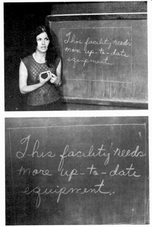
12.7 If the blackboard is divided into aspect-ratio fields, you can get a
closeup of an entire sentence.
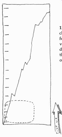
12.8 Tilting up on a chart that reveals its information step by step vertically
is often more dramatic than showing the information all at once.
------------------------
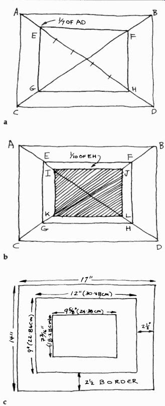
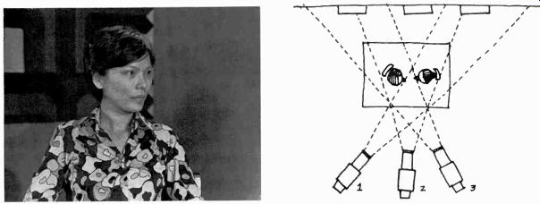
12.9 How large should the scanning and essential areas be in relation to
the overall size of the studio card? Rather than quoting area percentages,
which you may find difficult to translate into workable dimensions, let us
consider a simple procedure. Assuming that your studio card is cut in a three-by-four
ratio, draw a diagonal from corner to corner.
Measure its length. Divide this figure (length of the diagonal) by seven. Take this new figure (V7 of the diagonal) and mark it off on the diagonal, starting at one of the corners (see a). This gives you the corner point for the scanning area.
Scanning Area: Draw diagonals AD and BC from the corners of the card. Measure one of the diagonals (AD). Divide this figure by seven. Mark off this distance (Y7 of the diagonal) on the AD diagonal, starting at point A. This will give you point E. From E, draw lines parallel with the outside borders of the card. The points where the lines intersect with the diagonals (E, F, G, H) define the scanning area.
To arrive at the essential area, repeat a similar process, taking the scanning area as your new outside borders. Again, measure the diagonal from one corner to the next. Divide this figure (length of the diagonal of the scanning area) by ten. Take this new distance (14u of the diagonal) and mark it off on the diagonal of the scanning area, starting at one of the corners (see b). This point gives you the corner for the essential area.
Essential Area: Measure the diagonal of the scanning area (EH). Divide this figure by ten. Mark off this distance ( 710 of the diagonal of the scanning area) on the EH diagonal, starting at point E. This will give you point 1. From I, draw lines parallel with the borders of the scanning area. The points where the lines intersect with the diagonals (I, J, K, L) define the essential area.
You will find that, by using the metric system, you will be able not only to measure the diagonals more accurately than with inches but also to divide the distances more easily into the 14 and 1/lo fractions.
The most popular studio card sizes are 14 X 17 inches (35.56cm X 43.18cm) and 11 X 14 inches (27.94cm X 35.56cm). You may want to simplify the metric measures to a 36cm X 43cm or a 27cm X 36cm format.
The advantage of the 14 X 17 format is that it has an equal 21/2-inch border on all sides, defining easily the 9 X 12-inch scanning area. The essential area is easily defined from the 9 X 12 dimensions of the scanning area. The diagonal of the 9 X 12-inch scanning area measures 15 inches. One-tenth of 15 inches is 1 1/2 inches. Since the 1 1/2 inches are marked off from both ends of the diagonal, you are left with the diagonal of the essential area measuring 12 inches. When you now draw lines parallel to the borders of the scanning area, you arrive at an essential area within the scanning area of 734, inches by 9% inches, or 18.28cm by 24.38cm (see c). A 14 X 17-inch studio card has a 21/2-inch border on all four sides, defining the 9 X 12-inch scanning area (22.86cm X 30.48cm). The essential area is 73/16 X 9% inches (18.28cm X 24.38cm). An 11 X 14-inch studio card has a scanning area of 7.5 X 10 inches (19.05cm X 25.4cm), centered within the card. The essential area, centered within the scanning area, measures 6 X 8 inches (15.24cm X 20.32cm). If you have already switched over to the metric system, or are willing to try now, you will want to work with a 31cm X 38cm studio card, which provides a 5cm border on all sides for the 21cm X 28cm scanning area. The essential area of the 31cm X 38cm card is 16.5cm X 22cm. The smaller 27cm X 36cm overall size is similar to the 11 X 14-inch card and has the same 19.05cm X 25.4cm scanning area, and the 15.24cm X 20.32cm essential area.
Once you have settled on a standard size for your studio cards, you may want to make a simple framing guide that immediately shows the scanning and essential areas. Take a standard studio card (with the standard outside dimensions) and cut out four small slots to indicate the scanning area. Then cut the essential area from the center of the card (see e). By placing this guide on top of a studio card, you can mark the respective areas quickly and accurately.
Also, you can easily check whether or not the lettering of a card already prepared will fall within the essential area.
Through the slots you can mark the scanning area as a guide for camera framing. The cutout in the center will reveal the essential area. Only what shows through this window will appear on the television screen.
------------------
12.10 Keeping information within the essential area is especially important
when using slides, since the television film camera cannot compensate for
anything that lies outside this space.
The scanning area is framed by the camera and shown by the preview monitors in the station. It is the area actually scanned by the camera pickup tube (12.9a). The essential area, sometimes called critical area, is centered within the scanning area. It is the portion seen by the home viewer, regardless of masking of the set, transmission loss, or slight misalignment of the receiver. Obviously, all essential information should be contained within the essential area.
However, if you use illustrations in addition to written information, try to extend them to the scanning area so that, if your picture area loss is less than expected, your illustration does not break off suddenly, leaving empty screen space.
The preparation for a slide is the same as for a studio card. Since the scanning area for a slide is the area as approximately outlined by the standard mask, make sure that when photographing artwork, you line up your still camera near the outside edges of the studio card. This way you will be assured that the essential area of the slide will not be too close to the slide mask (12.10). Observing the essential area is even more important for slides than for studio cards, since the television film camera cannot move on the slide to compensate for minor extensions. If the lettering goes beyond the essential area, the slide is unusable (see 12.11.) Readability and Balance The amount of information that can be simultaneously projected onto the television screen is limited. As we have seen, the area that conveys essential information is severely contained. As you will remember from previous sections, the limited resolution power of television will not reproduce artwork of small print satisfactorily. These restrictions are especially noticeable when motion picture credits roll by on the television screen. The smaller credit lines are usually impossible to read. But your main purpose in using television graphics is to communicate specific information to the viewer, and to do so with style. If there is any single advice about this endeavor, it is this: the simpler the graphic, the better the communication will be.
Readability in the context of television graphics means the ability to read the words that appear on the television screen. As obvious as this statement is, it seems to have eluded many a graphic artist. The letters should be fairly large, and should have a bold, clean contour. The less information you cram into the essential area, the better. It is often more sensible to prepare a series of slides, each one displaying a small amount of information, than one slide with an overabundance.
Readability depends also on the relationship between foreground and background. A busy (highly detailed) background makes even the boldest foreground information hard to read. If you need to add lettering to a detailed background-such as a super or key of scores over the live picture of a football stadium-make sure that the printing is simple and bold. If the background is plain, you may get away with somewhat fancier lettering (see 12.12, 12.13, and 12.14). Like any other type of graphic art, television graphics in order to be effective must exhibit both stability and tension. According to the subject matter, the relative tension might be either low (calm feeling) or high (excitement). The interrelationship of stability and tension is called balance.
Balance depends on many different visual factors, a discussion of which would go far beyond the scope of this handbook.' However, two factors are especially pertinent to television graphics. One is the angle of the horizon line relative to the screen, and the other is the distribution of graphic mass.
[[1. Herbert Zettl, Sight-Sound-Motion (Belmont, Calif.: Wadsworth Publishing Co., 1973), Chs. 6 and 7. ]]
12.11 (a) Although we can see quite readily all the written information on
this slide, the lettering goes beyond the limits of the essential area. (b)
When used on the film chain, the letters just fit on the screen of the control-room
monitor, which shows not only the essential area but also part of the scanning
area. (c) But on the home screen, which reproduces the essential area only,
some of the letters have been lost. This slide is, therefore, unusable for
on-the-air transmission.
12.12 A modest amount of information written in simple, bold letters provides
for maximum communication. When designing television graphics, keep in mind
that the essential area and the resolution power of the television system
are quite limited, and that the information displayed on the screen cannot
be recalled by the viewer for closer examination.

12.13 This card reads well. The illustration and text are contrasting enough
to show up well even under less than ideal reception conditions.
12.14 (a) This title does not read well. The brightness of the lettering
and the background are much too similar for easy reading. (b) With more contrast
between the lettering and the background, the title becomes more readable.
12.15 With a tilted horizonline, we assume a view different from everyday
experience, thus increasing the visual energy of the scene and make it look
and feel more dynamic.

12.16 A horizon that is level, in this case parallel to the bottom and top
edges of the screen, with the verticals perpendicular to the horizon, suggests
normalcy; it makes us feel as though we were standing upright on level ground.
12.17 Though the lettering is usually kept parallel with the horizontal screen
edges, and is therefore graphically stable, it does not render the background
dynamism ineffective. On the contrary, the combination between foreground
stability and background lability accentuates the general graphic energy of
the title.

12.18 In a stable balance, the degree of stability is high, relative to pictorial
dynamism. In a neutral balance, stability and dynamic factors are about even.
In an unstable (or labile) balance, the dynamic pictorial factors outweigh the stable ones.*
* Zettl, Sight-Sound-Motion, p. 169.
12.19 If the written material is not organized into distinct areas of graphic
mass, the screen area looks unbalanced and the information is hard to grasp.
While the lettering is generally kept parallel with the bottom or top edge of the screen, the background may be tilted in various degrees so that its horizon line is out of whack. A tilted horizon expresses excitement, dynamism, increased energy, tension. We are no longer standing on level ground (12.15). A level horizon line, one that is parallel to the bottom or top screen edge, on the other hand, suggests normalcy, stability (12.16). You can also achieve the various degrees of balance-stable, neutral, and unstable-through a careful distribution of graphic mass. Graphic mass is any picture element that is perceived as occupying an area within the frame and as having relative weight.
A person standing in the middle of the frame is a graphic mass, as is a red dot in the screen corner, or a block of titles. In balancing a title card, you simply consider all pictorial elements and the lettering as various forms of graphic mass.
As a matter of fact, most graphic artists balance a title card by trying to combine the written message into lettering blocks. Information is much easier to grasp when it is presented in blocks rather than randomly scattered all over the screen area (see 12.19 and 12.20). Color and Color Compatibility Since color is an important design element, you need to know something about its components and attributes, and how the television system reacts to them.
This includes color compatibility, or the reproduction of color as shades of gray on the monochrome system.
Color is determined by three factors: (1) hue, (2) saturation, and (3) brightness. Hue refers to the color itself-that is, whether it is blue, green, red, or yellow. Saturation (sometimes called chroma) indicates the color strength-a strong red or a pale blue, a washed-out green or a rich purple. Brightness (sometimes called value) indicates whether the color is dark or light.
If we had color production and color reception exclusively, hue and saturation would be our primary concern. In other words, you would be concerned primarily with the aesthetics of color-whether, for example, subtle greens and reds would harmonize (concern with hue), or whether you would like to have a stronger, more intense color instead of a pastel tone (concern with saturation). The lightness or darkness of the color (brightness) would, in this case, be relatively incidental.
The recognition and application of color harmony cannot be explained in a short paragraph.
They need experience, practice, sensitivity, and taste. But there is one very general way of dealing with color harmony and color balance that may be of help to you. Rather than trying to say which colors go with what other colors, let us simply classify them in two main groups: (1) high-energy colors and (2) low-energy colors. The high-energy group includes basic, bright, highly saturated hues, such as red, yellow, orange, green, and a warm blue. The low-energy colors are more subtle hues with a low degree of saturation, such as the pastel colors, or the browns, dark greens, purples, and bluish grays.
12.20 By arranging the titles in blocks of graphic mass, you achieve a degree
of balance appropriate for the information, and help the viewer comprehend
related facts at one glance.
To achieve balance, you can set a high-energy color against another high-energy color, so that they achieve equal graphic weight (such as yellow and red stripes), surround a high-energy color with a larger low-energy color area (such as a red dot on a dark gray ground), set off a small high-energy color area with a large low-energy color area (such as a subdued green area extending over most of the screen and a narrow red area filling the rest of it), or two low-energy colors of similar graphic weight (such as a wide horizontal stripe of brown covering the bottom third of the screen, with a subdued blue covering the top two-thirds).
One of the easiest ways to achieve balance is to use a low-energy color background, with the foreground design in high-energy colors.2 Although constant improvements are made in the image pickup devices (extended red Plumbicon tube, or separate mesh tubes), there are some things with which even the best color cameras have trouble. One is the color red. A highly saturated warm red or orange is not handled very well by the Plumbicon pickup tube. Even if it manages to reproduce the hue fairly accurately, the whole electronic system may rebel and produce excessive noise or, more frequently, color banding (clearly discernible bands of color that stretch horizontally over the whole screen). Another problem is any design containing narrow, contrasting color stripes. When the striped pattern coincides in a certain way with the lines of the scanning pattern, a moiré effect occurs, which shows up as color vibrations. As exciting as such vibrations may be as a special effect in a dance number, they are disturbing in a title card for a straight news show, or on the dress of a performer.
The monochrome television camera, and especially the monochrome receiver, is insensitive to hue and largely to saturation. All it shows you of a variety of colors is their relative brightness.
Monochrome cameras and receivers are colorblind; they translate every color they see into shades of gray. When you design graphics in color, don't just be concerned with the combination of hue and the degree of saturation, but pay special heed to whether or not the colors differ enough in brightness so that they show up as different grays on the monochrome receiver. This translation of color into grays is called color compatibility.
[[ Zettl, Sight-Sound-Motion, pp. 94-96. ]]
----------------

12.21 The surest way to determine whether you have enough brightness contrast
in your color scene-that is, whether your color scheme is compatible-is to
watch the scene on your monochrome monitor. If the picture looks sharp, if
it has "snap," your colors are all right. If it looks washed out,
lacking proper contrasts, your colors are not compatible.
Often it is enough just to put a few color swatches in front of the camera under normal lighting conditions to see how they register on the grayscale. In fact, with a little experience you will find that just by squinting your eyes you can determine fairly well whether two colors have enough brightness contrast to assure compatibility.
Experienced scenic and graphic artists often devise highly compatible color schemes without ever consciously checking relative brightness. A good painter usually juxtaposes colors that differ not only in hue but in brightness. You might want to look up some high-quality monochrome reproductions of famous paintings to see how "compatible" the color schemes are. (See color plates V-IX.)
----------------
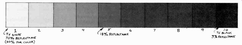
12.22 10-Step Gray-scale: In the 10-step grayscale, the brightness range
from the brightest point (TV white) to the darkest point (TV black) is divided
into ten steps.
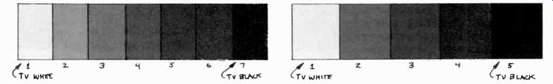
12.23 7-Step Grayscale: You will find that most good television systems reproduce
only seven distinct steps of gray between TV white and TV black.
The 7-step grayscale is, therefore, often preferred as the more realistic guide to color compatibility than the 10-step grayscale.

12.24 5-Step Grayscale: Many production people work on the assumption that
most television receivers reproduce only five steps of gray, especially when
reproducing a color show in black and white.
They use the 5-step grayscale as a standard for graphic art.
12.25 Since it takes relatively little reflected light to produce a dark
gray or even a medium gray on the television monitor (approximately the middle
of the grayscale), step five on a 10-step grayscale, or step four on a 7-step
grayscale, does not coincide with the middle of the light reflectance range
(50 percent). In fact, a color with a reflectance of 50 percent is in the
upper ranges of the grayscale, and actually registers as step two on the 10-step
grayscale. A color that reproduces under normal circumstances in the middle
ranges of a grayscale usually measures only about 18 percent reflectance.
Since on the color receiver, white is actually a combination of red, green,
and blue (additive mixing), TV white has only a 60 percent reflectance (see
illustration).
12.26 The plain title card is prepared for the studio camera. It is shown
as is and is not mixed with any other video source.

12.27 A super, or key, card generally has white lettering on a black background.
During the super or key operation the black background drops out and lets
the second video source show through.
As long as there are monochrome receivers in use, you must consider the problem of color compatibility. To achieve a color design that has enough brightness contrast for good compatibility is not always an easy job. Even if you select colors that have various degrees of brightness, intense light levels may wash out all but the most extreme brightness contrasts. If a dark color (low degree of brightness) is illuminated by a large amount of light, it may show up a lighter gray on the monochrome receiver than a light color that is in a shadow area.
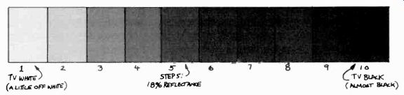
Grayscale The brightness of a color is usually measured by how much light it reflects. We have already talked about reflectance percentages in our discussion on lighting (Section 6). The television system is not capable of reproducing pure white (100 percent reflectance) or pure black (zero percent reflectance); at best, it can reproduce an off-white (about 70 percent for monochrome television, and only about 60 percent for color), and an off-black (about 3 percent reflectance). We call these brightness extremes "TV white" and "TV black." If you now divide the brightness range between TV white and TV black into distinct steps, you have the television grayscale.
The most common number of brightness steps in a grayscale is ten (12.22). However, the system can reproduce all ten steps only under the most ideal conditions. A grayscale of seven steps is more realistic for monochrome television (12.23), and you may find that many color shows translate into only five (12.24). Just think if you had only five tubes of different grays to paint every conceivable scene on the television screen. This is the brightness limitation of most monochrome television.
In color television, it is often the hue that distinguishes one area from another. But if the hues have the same brightness-that is, if they reproduce on the monochrome receiver as the identical step on the grayscale-the viewer will not be able to distinguish between them (see color plait, V). Make sure, therefore, that your background color is different from the foreground color not only in hue but also in brightness. A 2-step brightness difference between the foreground and background colors is considered a minimum spread.
Style --Style, like language, is a living thing. It changes according to the specific aesthetic demands of the people at a given location and time.
To ignore it means to communicate less effectively. You learn style not from a book but primarily through being sensitive to your environment, by experiencing life with open eyes and ears, and especially an open heart. Some people not only sense the general style that prevails at a given time, but manage to enhance it with a personal, distinctive mark.
But whether you are a style setter or not, the style of the art work should match the style of your entire show. Even the opening titles should give some indication of its type and character. In a comedy show, for instance, cartoon lettering or an amusingly animated film opening helps to get the viewers' attention and prepare them for the show content. A dramatic show, on the other hand, may be identified by supering simple and unobtrusive titles over live action. But don't go overboard on style and identify your guest performer from China with Chinese lettering, or your newsreel of the downtown fire with flame letters. Don't abandon good taste for effect.
Types of Television Graphics
The major types of television graphics include (1) the plain title card, (2) the super, or key, card, (3) the chroma key card, (4) the slide, (5) the crawl, (6) the character generator, and (7) maps and charts.
12.28 If you super a name over a medium shot of a person, keep the lettering
as close to the bottom edge of the essential area as possible (a). During
the super, the name will then cut across the person's chest rather than his
face (b).
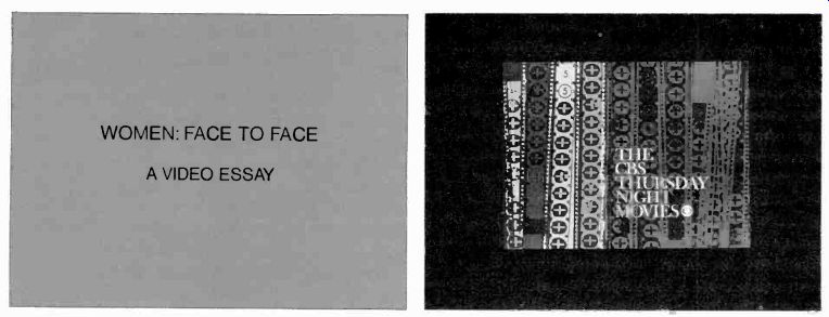
The Plain Title Card:
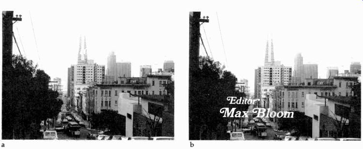
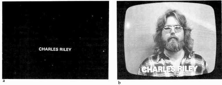
The plain title card has simple information, such as the title of the show, the names of performers, writers, producer, director, printed on a plain colored (or gray) background. The plain title card is shot by the camera and displayed on the screen. It is generally not combined with any other video source (such as a live background scene or a chroma key background), but it may have some artwork drawn on the card in addition to the lettering (12.26). The Super, or Key, Card The super, or key, card is usually a black card containing white lettering. During a super or key, the black background drops out, revealing the background scene over which the white letters appear (12.28). Since this title is combined with another video source, the background scene, the information given on the super card should be as terse as possible. Use simple, bold letters only, and try to restrict the amount of information. If your special effects on your switcher allows a reverse key, you can use a white background card with black lettering on it.
If you want to identify a guest by supering or keying his name over his picture on the screen, make sure that the super does not cut across his face. The viewer is interested in getting to know the guest on the screen as well as possible. Besides defeating this goal, covering someone's face with writing seems rather impolite. To avoid this problem, put the name of the guest, or any other super identification, as close to the lower edge of the essential area as possible. The camera operator will be able to frame the super in the lower part (lower third) of the viewfinder, thus landing on the guest's chest rather than his face (assuming you are on a medium shot) (12.28). The Chroma Key Card The chroma key card is much like the regular super card, except that the background for the white lettering is blue instead of black. Instead of supering the card over the background scene, you key the lettering into the background scene through the chroma key process. Since blue drops out during the keying, only the letters remain. But chroma key cards also consist of various colored backgrounds with one or two words and a simple design placed in the upper right- or left hand-corner of the essential area. If slides are not available, such cards are used as background for news stories; matted into the news set, they provide an immediate visual identification of the story underway. More often, they are photographed and used as slides so that the change from one chroma key background to the next can be accomplished smoothly, without tying up a camera on the floor.
The Slide:
Slides are often more advantageous than studio cards since they do not tie up a studio camera and are not difficult to change on the air.
As pointed out before, all pertinent information must be kept within the essential area, since the telecine camera cannot adjust for wider copy.
Since the lamps in television slide projectors are usually quite hot, and the alignment of the slides relative to the multiplexer is quite critical, all slides should be mounted between thin glass plates. Thus, they cannot buckle in the heat and go out of focus.
The Crawl:
If you have a good deal of information to display on the screen, such as the closing credits for a large production, you should use a crawl instead of a large number of slides. By this method the written information seems to roll up the screen in one continuous motion. Since the dimensions of a crawl differ widely, there are no standard specifications. Its length depends on the amount of information, and its width must be sufficient to accommodate the longest line within the essential area. The lines are usually lettered on a strip of black paper that is then mounted onto the crawl (12.29). The drum is rotated either by hand, or, more commonly, by motor. Since the letters generally move from screen-bottom to screen-top, the drum should rotate away from the camera, not toward it.
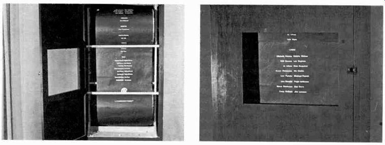
12.29 The crawl is a strip of paper on which the long list of credits is
lettered. As you rotate the drum in a direction away from the camera, the
credit lines seem to move up the screen. The faster the drum rotates, the
faster the lines appear.
12.30 Character Generator: A character generator produces a variety of letters
electronically. They can be stored and recalled at any time for a key or matte
key. The lines can be moved right or left on the screen, rolled up or down,
or crawled sideways.
The Character Generator:
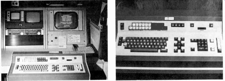
For the majority of written graphics, most professional television operations use the character generator. This is a special effects device that creates letters and numbers in a variety of sizes and fonts (letter designs). Some of the more sophisticated character generators can even produce simple graphic displays such as sales curves and bars that show percentages. Through a colorizer, the letters can be programmed in various colors (12.30). To prepare the material, you type the needed titles on a computer-type keyboard. The information is then stored on a disc and can be recalled from the switcher and keyed like any other special effect. Since the letters are electronically generated, they can be placed anywhere on the screen. A cursor (location indicator) shows you the exact location where the first word will appear.
By moving the cursor into various positions, with the words or lines following, you can center the information, or put it off-center, roll it up and down or sideways on the screen.
Although you have just learned that a crawl is a series of lines moving up the screen by means of a rotating drum, you must modify this terminology somewhat when using a character generator. A crawl by this method means moving the lines sideways on the screen; an up or down movement is called a roll.
Maps and Charts:
Maps are an important visual aid for many television programs, especially newscasts. Usually, they are extremely simplified, showing only the detail that is most essential for the specific communication. For example, if you make a weather map of your area, you don't need to draw in the freeways. On the other hand, if you use the map to show the traffic patterns in your city, you need to show the major streets but not necessarily the location of parks and public buildings.
Commercially available maps are much too detailed to be of much use in television. If you have to use an existing map, emphasize the major areas through bold outlines and distinctive colors.
Make sure that all colors have enough brightness contrast for good black-and-white reception.
If large water areas are to be set off against land, as in a map of the San Francisco Bay Area, you will have to decide whether to make the water darker or lighter than the land. The difficulty is that the viewer may see the map in reversed polarity, which will make water areas look like land and land areas look like water. In general, making the land areas lighter assures the correct orientation (see 12.31).
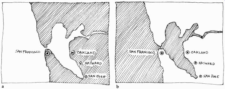
12.31 (a) When the water areas are lighter than the land areas, the water
seems to be above the land. Therefore, the viewer may see the water and the
land as exactly opposite to what they really are. (b) In order to make the
land areas appear higher than the water, simply make them lighter in color
(or brightness).
If you work in color, a fairly dark, saturated blue for the water and a light beige or green for the land will make the water lie under, rather than above the land. Also, in monochrome reception, the water will appear dark and the land light.
We have already indicated that certain charts may be presented out of aspect ratio, if you intend to reveal the information gradually through a tilt or pan. In all other cases, try to contain the data in aspect ratio, so that the camera can take closeups without losing important information.
Make sure that the charts are easy to read. Matter that gets lost in the transmission process is of no use to the home viewer. Maximum clarity--together with adherence to scanning and essential areas-should be your chief objective in preparing charts for television.
Preparation and Operation:
Basic graphic arts techniques apply also to the preparation of television graphics. For graphics to come through as an intrinsic part of the television presentation, their assembling and manipulation before the cameras require skill, practice, and planning.
Preparation--If you have an electronic character generator, the need for mechanical lettering is drastically reduced. If, however, you do not enjoy such luxury, you may still have to rely on manual methods, such as rub-on or glue-on letters. The hot-press has been the mainstay of the television art department for many years, and is likely to remain the chief lettering tool for some time to come. The reasons for its popularity are simplicity of operation, versatility, and quality results.
Standard lead type is heated by the press (to about 250°) and pressed upon a plastic film. The film is literally melted onto illustration board, clear acetate cells, or any other material you may want to use as a background (12.32). There is a variety of colored illustration board available, which you can cut up into the studio card size of your choice. Make sure that it has a mat surface to prevent glares.
As mentioned before, slides are prepared exactly as studio cards and then photographed and mounted. A quick and simple system is to photograph the artwork with a Polaroid camera equipped with special 2 X 2 slide accessories.
If you prepare artwork for a normal super, or key, slide, print black letters on a white card. The photographic process reverses the polarity of the artwork, and you can use the film negative with the black background and the white letters directly for your super slide.
If you want to use a photograph, or a picture from a book, as a slide background, you can print your text on an acetate cell (clear plastic), put the cell on top of the background picture, and photograph both together.
In preparing a crawl, you may want to print the various names on strips of black paper and mount them on the crawl paper. This way you will not have to redo the whole crawl if you discover a misspelling. Also, you can rearrange the strips quite easily in order to accommodate another credit line.
Operation
Studio cards are put on studio easels for easy camera pickup. You will need at least two easels per studio so that you can cut from card to card. You can also change the cards on a single easel, either by flipping or pulling one after the other. Such "hot" flips or pulls, however, need practice so that they look smooth on the air. Although you should flip the cards as fast as you can, you should realize that a neat, slow flip looks better than a fast, sloppy one.
Always bring the easel to the camera, not the reverse.
When placing the easel, make sure that it is square with the camera. Otherwise, the title will look as if it is running uphill or downhill on the screen. If the lettering runs uphill (high on the right), rotate the easel clockwise (12.33). If the lettering runs downhill (high on the left), rotate the easel counterclockwise (12.34). Special effects wipes have all but eliminated animated graphics. There are, however, two methods that are simple and reliable enough to be used on a live camera. One is the pull-off card, the other the pull-off strip.
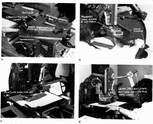
12.32 (a) First, lock the type in mirror image into the chase and preheat
the whole thing on a special hotplate to approximately 250°. (b) Then insert
the chase into the hot-press, whose head has also been preheated to the same
temperature. (c) Line up the card underneath the chase and place the plastic
film (which comes in a variety of colors) on it with the shiny side up. (d)
Bring the lever down quickly and hold the hot type on the card very briefly.
If you keep the lever down too long, the heated plastic will seep into the
material and make the letters fuzzy-edged.
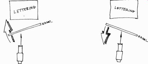
12.33 If the lettering is high on the right, rotate the easel clockwise.

12.34 If the lettering is high on the left, rotate the easel counterclockwise.
12.35 By pulling a masking tape off a back-lighted slot, directional movement
is applied to a graphic.
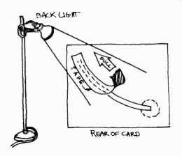
A pulloff card is simply a black card that is put over the title card. If you pull the cover card from camera-left to camera-right, the lettering on the card underneath will be revealed gradually. The faster you pull, the faster the letters will appear.
The pulloff strip is used to animate simple charts. To demonstrate the flight path of a communication satellite, for example, cut a small slot into the card for the flight path and back-light the whole graphic. Then place opaque masking tape over the slot to prevent the back light from shining through. As you pull off the tape, the flight path will gradually come into view (12.35). One final word, about copyright. Whenever you present printed material, including reproductions of famous paintings, professional photographs, illustrated books, and similar matter, you must obtain permission from the copyright holders.
Scenery:
Television scenery consists of the three-dimensional elements of design that are used in the studio. Its principal function is to create a specific environment--a faithful recreation of a Victorian living room for a dramatic scene, a somewhat stylized workroom for a news show, a simple definition of space through pillars and sculptures for a modern dance number. In any case, television scenery should allow for optimum camera movement and camera angles, microphone placement and boom movement, appropriate lighting, and maximum action by the performers and actors.
Since the television camera looks at a set both at close range and at a distance, scenery must be detailed enough to appear realistic yet plain enough to prevent cluttered, busy pictures. And, since it is the camera and not the studio spectator that looks at the set, the scenery does not have to be continuous. One part of the set--for example, the main entrance of a house-may be in one corner of the studio, and another part--say the hallway--in another corner. The location of these portions depends entirely on the shooting sequence and on the director's camera placement.
Fortunately, the relative mobility of the television (or film) camera has made the building of elaborate sets largely unnecessary, at least in small station operation. If you need to shoot inside an elaborate Victorian parlor or a motel bedroom, go there. Take the cameras to the location; don't try to bring the location into the studio.
Contrary to film, where the environment is an important dramatic agent, television's primary dramatic material and focus of attention is the human being. In general, the scenic environment, though important, remains secondary.
Nevertheless, all human actions take place in some sort of environment. The empty studio is rarely the most appropriate, or the most pleasing, one for human interaction. Even if you are seldom, if ever, called upon to design or construct elaborate scenery, you should nevertheless know the elements of this calling. The knowledge will aid you in managing the studio space, as well as screen space in general. The basic elements are (1) scene design, (2) the floor plan, (3) types of scenery and construction, and (4) properties and set dressings.
Scene Design:
Before you design a set, you must know what the show is all about. Talk to the director about his concept of the show, even if it is a simple interview. Arrive at a set by defining the necessary spatial environment for optimal communication rather than by inquiring what other stations are doing. For example, you may feel that the best way to let your viewers in on what's new is not by having an authoritative newscaster read stories from a pulpitlike contraption, but instead by moving the cameras into the newsroom itself, or, better yet, out into the street where it's happening. If you have an interviewer probing tactfully, yet persistently, into the guest's attitudes and feelings, you don't need a whole living room as a set. Two comfortable chairs in front of a plain background may make the scene complete. In any case, before deciding on a set, try to see the entire show in screen images. Try to imagine those you would like the viewers to see and work backwards from there.
For example: "If in an interview I would like the viewer to see intimate closeups throughout the show, what set do I need?" "Two chairs." Designing scenery is a highly specialized profession, and should therefore be left to the specialist. Elaborate sets are designed by the art department, or in small station operations often by a free-lance designer. In college operations, the theater arts department usually takes care of the more ambitious set design and construction jobs.
However, you need to know at least the basic components of scene design.
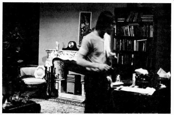
12.36 This set designer provided proper background variety for the long shot
only. The picture between the two people breaks up the center of the picture
reasonably well and provides some visual interest for an otherwise dull shot.

12.37 But on a closeup of the guest-the most frequent shot in the show-we
have no background variety. The same is true in a closeup shot of the host.

12.38 Now the picture is properly hung for background variety, although you
would ordinarily not hang a picture in this position.
12.39 To avoid looking down at persons who are seated, place the chairs on
a platform. The cameras can operate at a comfortable working height and yet
shoot the scene from eye level.
12.40 The open set is discontinuous. It does not have actual room or a closed
set, which duplicates an actual defined by a few major pieces of scenery and
furniture, set from different points of view.) connecting walls as in an room.
Rather, the space is (See shots-opposite-of
Set Background
The set background is an important scenic element. It not only helps to unify a sequence of shots and place the action in a single environment, but also provides necessary variety.
Unification of shots can be achieved through keeping the background in a uniform color, or by decorating it in such a way that the viewer can easily relate one portion of the set to another.
Since in television we see mostly environmental detail, you must give the viewer clues so that he can apply closure to the shot details and achieve, at least in his mind, a continuous environment. A uniform background color or design, or properties that point to a single environment, such as the typical furnishings of a kitchen-all help the viewer relate the various shots to a specific location. The variety is achieved by breaking up large background areas into smaller, yet related, areas providing the cameras with elements necessary for inducing a certain amount of graphic tension.
Hanging pictures on a plain wall is as simple a method for background variety as it is effective.
However, make sure that such design elements are indeed in the view of most camera shots (see 12.36, 12.37, and 12.38). As so often happens, pictures are hung the way we expect them to appear in a living room, for example, rather than in range of the camera shot. But what the camera does not see, the viewer will not see, and therefore it remains utterly useless (12.37). Eye Level Camera operators have the undesirable habit of adjusting their cameras to the most comfortable working height, and not necessarily to the most effective aesthetic point of view. Therefore, if you place persons in normal chairs on the studio floor, they are positioned lower than the average camera working height; the camera looks down on them. This point of view carries subtle psychological implications of inferiority and also creates an unpleasant composition. You might do well, therefore, for any event where the performers are sitting most of the time, to place the chairs on a platform (anywhere from 6 to 12 inches high). Thus, the camera can remain at a comfortable operating height, shooting at the scene at eye level.
The Open Set
Contrary to the closed set, where the scenery is continuous, very much like the walls in an actual room, the open set is discontinuous. This means that you use only the most important parts of a room-perhaps the door, a sofa, a table with a lamp as a foreground piece, a few freestanding walls with pictures on them, and so forth (12.40). Since the camera rarely sees the whole room anyway, but only significant details, the viewer mentally fills in the missing parts of the room. This is called psychological closure.
There are many advantages of the open-set method: (1) The camera can look at the set and the action from many points of view without being restricted by closed walls. (2) The performers or actors have great freedom of movement. (3)
The set is relatively easy to set up and strike (take down). (4) The set is easy to light. (5) The microphone boom can operate rather freely. And (6) the set is economical; it needs only a few flats and set pieces.
The open set can look extremely real, provided that its individual portions are realistically treated (furniture, flats, pictures, lamps) and that the director knows how to shoot inductively, to suggest a continuous environment by showing only significant details. The uniform background for the open set may be the unlighted cyclorama, which appears not piecemeal, as holes in the set, but as a solid dark unit.
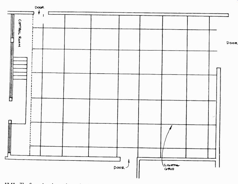

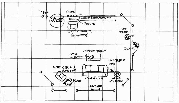
12.41 The floor plan shows the studio floor area, which is further defined
by the lighting grid or the pattern of the lighting battens.
Studio Floor Treatment:
One of the headaches of the scenic designer is the treatment of the studio floor. In long shots, it usually looks unattractive, as though the designer got tired of his idea before he reached the bottom of the picture.
The problem with decorating the studio floor is that the adornment must not interfere with camera travel. Rugs, for instance, make sense only in areas that are not used by cameras. Fortunately, the zoom lens can substitute for camera travel to some extent, thereby allowing floor coverings in certain scenes or sets.
A flexible rubber tile, which you can get in large (3 X 3 foot or roughly 1 X 1m) squares, makes excellent floor patterns. You simply lay it tightly on the studio floor in the desired pattern, and natural adhesion will keep the tiles in place.
For some sets, you can paint a design on a portion of the studio floor, or on a platform that supports part of the action. In an interview set, for example, you can decorate the platform with multicolored rug stripes or paint it in some appropriate pattern, without having to worry about the rest of the studio floor.
----------------------------

12.42 You may want to consider using the metric scale for your floor plan.
You will find that this is a much easier way to figure out proportions and
fractions than the English system of measurement. One scale may be 1cm = 1m.

12.43 Although you may not want to become a set designer, you should nevertheless
learn how to draw a basic floor plan and translate it into an actual set,
into movement of performers and cameras and, finally, into television screen
images.
When drawing a floor plan, watch for these potential problem areas: (1) Most often, a floor plan shows scenery backing that is insufficient for the foreground piece, for example, a single 10-foot-wide flat as backing for a whole set of living room furniture. The tendency is to draw furniture and other set pieces too small in proportion to the covering background flats. For indicating the prop furniture in your floor plan, it may help you to use the templates architects use. You can then place the furniture first and draw the necessary background later. (2) During the setup, you may notice that the available studio floor is always less than your floor plan indicates. Make sure, therefore, to limit your set design to the actual available floor space. (3) Always place your active furniture (used by the performers) at least six feet (roughly two meters) from the set wall, so that the back lights can be directed at the performance areas at not too steep an angle. Also, the director can use the space between wall and furniture for camera placement.
-------------------------------
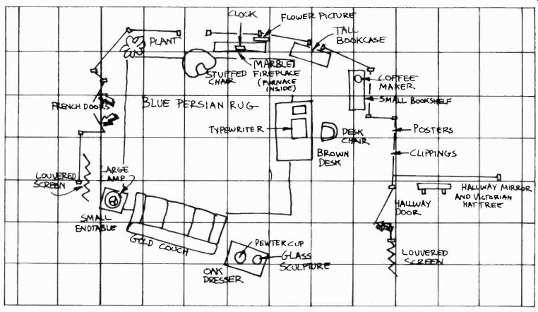

12.44 The completed floor plan shows the exact location of the scenery and
set properties, relative to the lighting grid or pattern of battens. The floor
personnel use this plan as a guide for setting up the scenery and placing
the major properties.
The Floor Plan:
All set design is drawn on the floor plan, which is literally a plan of the studio floor. It shows the floor area, the main studio doors, the location of the control room, and the studio walls. To have a specific orientation pattern according to which the sets can be placed, the lighting grid, or batten locations, are drawn on the floor area (12.41). In effect, the grid resembles the orientation squares of a city map. (See 12.44.) The scale of the floor plan varies, but it is normally 1/4 inch =1 foot. All scenery and set properties (furniture, lamps, and so forth) are then drawn to scale in the proper position relative to the studio walls and the lighting grid ( see 12.44). The floor plan is an important aid for all production and engineering personnel. It is essential for the floor crew, who must set up the scenery and place the major set properties. The lighting technician needs it to plot the general lighting layout. The director uses it to visualize the show and block the major actions of performers, cameras, and microphone boom. The audio engineer can familiarize himself with specific microphone placement and other possible audio requirements.
The performers will be able to anticipate their movements and spot potential blocking problems.
If you use the floor plan for your lighting plot, simply add a transparent overlay to draw in your major light sources. If you design a set, or if you have to arrange a simple one without the aid of a floor plan, try to put it where the lights are. This means that you should place it in such a way that the back lights, key lights, and fill lights hang approximately in the right position. Sometimes a set is placed in a corner of the studio where most of the lighting instruments have to be re-hung to get proper illumination, when in another part of the studio the same set could have been lighted without moving a single instrument. As you can see once again, you cannot afford specializing in one television production activity by disregarding the other production aspects. Everything interrelates, and the more you know about the other production techniques and functions, the better your coordination of the various elements will be.
Types of Scenery and Construction
If you are a member of the floor crew, or if you want to communicate intelligently with the scene designer, you should know the basic types of scenery and some major methods of scene construction. We can divide scenery into three major groups: (1) standard set units, (2) hanging units, and (3) set pieces.
Standard Set Units:
Standard set units have a uniform height, yet various widths. The height is usually ten feet (3.05m); the widths range from one to five feet (30.5cm to 1.52m). Single units are called flats. When two or three flats are hinged together, they are called two-folds or three-folds. If you have a low-ceiling studio, you may find the 8-foot height (2.44m) more convenient.
For small station operation, where you do not have the luxury of building new sets for every show, you might consider the use of set modules that can be used in a variety of configurations. A set module consists of flats that can be used either right-side up or on their side, and whose widths are such that, when several flats are stacked sideways, they are equal to the height of the flats, or when connected sideways, they are equal to the width of a twofold, for example. Many architects work with such modules, especially in large structures, where prefabrication is an essential building factor (see 12.45).
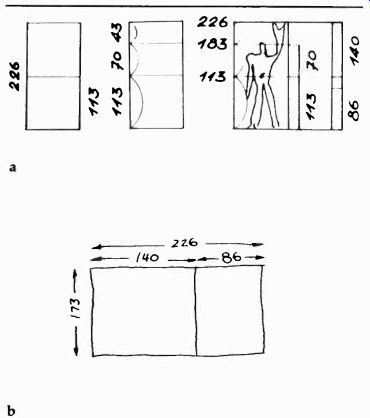
12.45 One of the by now famous modules has been designed by the Swiss-French
architect Le Corbusier. His Modulor consists of a set of proportions that
are modeled after the basic proportions of the human figure (a). You may want
to try to use these dimensions for your scenery modules (b).
Hanging Units
While the flats stand on the studio floor, hanging set units are supported from the lighting grid or battens. The most versatile hanging background unit is the cyclorama or cyc, a continuous piece of muslin or canvas stretched along two, or all four, studio walls. Some cycs have a scrim (loosely woven material) stretched in front of them in order to break the light before it hits the cyc, thus producing a very soft, uniform background. (See 12.46.) The drop is a wide roll of canvas with some sort of background scene painted on it. It commonly serves stylized settings, where the viewer is very much aware that the action is taking place in front of a canvas drop. Some drops consist of large photomurals for very realistic background effects.
The chroma key drop is a wide roll of chroma key blue canvas that can be pulled down and even stretched over part of the studio floor for chroma key matting.
A variety of normal drapes for interior sets also belong in the category of hanging units.
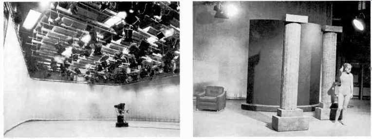
Set Pieces
Standing pieces of scenery that are neither flats nor furniture are described as set pieces. They include pillars, pylons (which look like three-sided pillars), periaktoi (a periaktos is a three-sided standing unit, very much like a large pylon, that swivels on casters for quick scene changes), sweeps (a curved piece of scenery, similar to half a very large pillar), steps, blocks and pedestals, platforms and wagons (a wagon is a platform on casters), and a variety of folding screens.
Set pieces are an important scenic element.
They can define the large studio space for a dance number, for example, without blocking the movement of the camera and dancers, or as foreground pieces. Or, they can be used at the outer edges of a set, to signal to the cameras not to shoot beyond. (See 12.47.) The platforms and wagons serve as elevation devices. You might want to mount a whole set on wagons so that it can be rolled in and out of the studio quickly. Blocks and pedestals are generally used for simple displays. Screens serve as backgrounds for simple displays, as set end pieces, or to simulate windows or doors.
The construction of scenery is usually done by a professional stage carpenter or similarly qualified personnel. The materials and techniques used are extremely varied and depend entirely on the purpose of the show. Sometimes the scenery must represent as real a setting as possible; at other times, the set is purposely stylized, serving more of a decorative function. The availability of a great variety of plastic panels and the ability to mold existing plastic sheets into any number of relief patterns have made it possible to construct amazingly realistic scenery at a rather low cost.
Also, the use of slotted steel instead of wood frames, and hardwall material instead of canvas, has led to the creation of highly flexible, durable, and realistic pieces of scenery (12.48). When setting up scenery, make absolutely certain that all pieces are safely anchored so that they will not tip over when bumped against by performers or cameras. As in all other aspects of television production, do not forsake safety for convenience or speed.
Properties and Set Dressings:
Properties and set dressings are essential scenic elements. In television, they often do more to signify a particular environment than the background does.
There are three basic types of properties: (1) stage properties, or props, (2) set dressings, and (3) hand props.
Stage Props
Stage props include the common type of furniture and items constructed for a specific purpose, such as news desks, lecterns, or panel tables.
12.46 The cyclorama provides an ideal background for a great number of productions,
especially for open-set designs.

12.47 Set pieces are freestanding elements of scenery that define studio
space without blocking large areas, serve as foreground pieces, or signal
the outer limits of a set.
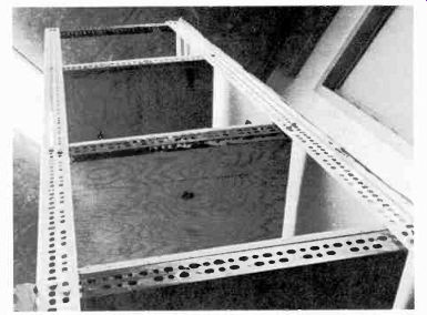
12.48 The use of slotted steel has made television scenery extremely flexible.
For the normal complement of shows, you will need enough furniture to create settings for a modern living room, a study, an office, or a comfortable interview area. You can use real furniture. For the interview area, small simple chairs are more useful than large, elaborate ones. It is often difficult to bring oversized chairs close enough together for intimate spacing of the two-shot. The edges of the screen seem to attract items within the frame, making them appear farther apart than they really are. Small chairs can be placed close enough together so that they do not look too far apart on the screen, without making the persons sitting on them too awkward or fidgety. Try to get chairs and couches that are not too low; otherwise sitting and rising gracefully may become a problem.
Stage props for special shows, such as news desks and panel tables, are specially built to fit the overall design. But make sure that these props look stylish and that they work well. Since most sets of this kind are seen in their entirety only in the opening or closing shots, it is very important that the properties used in them be functional and look appropriate on the screen in a closeup as well as a long shot.
Set Dressings:
Set dressings are a major factor in determining the style and character of the set. While the flats may remain the same from one type of show to another, the dressing will give each set its distinguishing characteristic. Set dressings include draperies, pictures, lamps and chandeliers, fireplaces, flower pots, indoor plants, candleholders, sculptures. Secondhand stores provide an unlimited fund for these things. In case of emergency, you can always raid your own living quarters.
Hand Properties:
Hand properties consist of all items that are actually handled by the performer or actor during the show. They include dishes, silverware, ashtrays, telephones, typewriters. If you have to use food, make sure that it is fresh, and the dishes and silverware are meticulously clean. Liquor is generally replaced by water (for clear spirits), tea (for whiskey), or soda pop (for red wine). With all due respect for realism, such substitutions are perfectly legitimate.
The most important thing about hand props is to have them actually on the set for the performer to use. They represent a major production item and are anything but incidental.
One last word about design. In a successful design, all items interrelate and harmonize with one another, from the largest, such as the background scenery, to the smallest, such as the ashtray on the end table, or the title card. Good design displays a continuity of style.
Summary:
Design sets the style for a television station and its operation. The two major design factors are (1) graphics and (2) scenery.
Television graphics include all two-dimensional visuals that are especially prepared for the television screen, such as title cards and credit crawls, special illustrations, maps, and charts.
These are the major factors of television graphics: (1) overall specifications, (2) types, and (3) preparation and actual operation.
The specifications include (1) aspect ratio, (2) scanning and essential areas, (3) readability and balance, (4) color and color compatibility, (5) gray-scale, and (6) style.
The major types of television graphics are (1) the plain title card, (2) the super, or key, card, (3) the chroma key card, (4) the slide, (5) the crawl, (6) the character generator, and (7) maps and charts.
There are many methods of graphics preparation.
In the absence of an electronic character generator, most title cards are hot-pressed onto gray, black, or colored illustration board. All graphics must meet the electronic requirements of the camera and the operational requirements in the studio.
Scenery consists of the three-dimensional elements of design that are used in the studio. The elements of television scenery are (1) scene design, (2) floor plan, (3) types of scenery and construction, and (4) properties and set dressings.
The floor plan shows what scenery is used and where it is used relative to studio space.
The major types of scenery are (1) standard set units, (2) hanging units, and (3) set pieces.
Properties and set dressings include (1) stage properties, such as furniture, desks, and lecterns; (2) set dressings, such as draperies, pictures, lamps; and (3) hand properties, such as dishes, ashtrays, telephones, and other items that are handled by the talent.